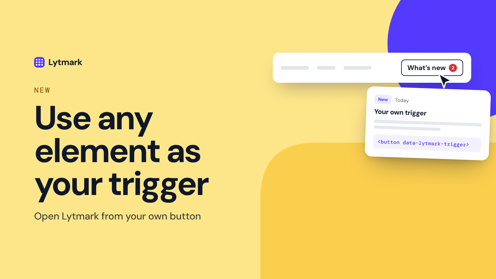
The round launcher in the corner works for most sites. But if your product already has a natural place for news, like a "What's new" link in your navbar or a bell in your app header, that element can open Lytmark instead.
⚙️ How it works
Add one attribute to any clickable element on your page:
<button data-lytmark-trigger>What's new</button>That's it. Clicking it opens the widget. It works on buttons, links, menu items and icons, and you can add the attribute to as many elements as you like, for example one in the navbar and one in the footer.
✨ What happens automatically
The corner launcher hides itself as soon as the widget finds a trigger on the page, so visitors never see two ways to open it.
Works with modern apps. Triggers that appear later, after a route change in React, Vue or Next.js, or inside a menu that only opens on click, are picked up without any extra code.
Your styling stays yours. It's your own element, so it keeps your fonts, colors and hover states. No need to match anything to our design.
🎛️ Set it up in Customize
Open Customize, go to Appearance → Position and choose My own button. The live preview next to the settings shows what your visitors will see. Save, add the attribute to your element, and you're done.
💡 Where it works well
A "What's new" link in your navbar or footer
An item in your app's help or account menu
A small banner or button right after you ship something big
Tip: put the trigger where your users already look for help. The easier it is to find, the more people read what you ship.